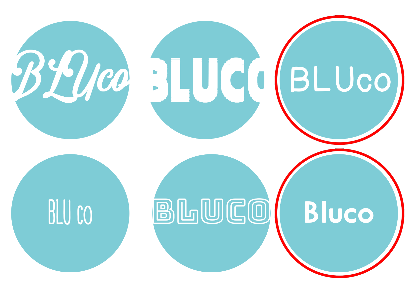
I have created different design logo’s for my app through different types face. Fellow peers enjoyed the bright blue circle design as it is appealing and engaging which I wanted to achieve. However I needed peer feedback for what typeface I should use. The red highlighted circles is the popular decision as they liked the type size as it has variation from capitalisation and lowercase. I took that constructive criticism and in the peer review sheet bold font was suggested to make in engaging and easy. Therefore i combine all the feedback and created this.

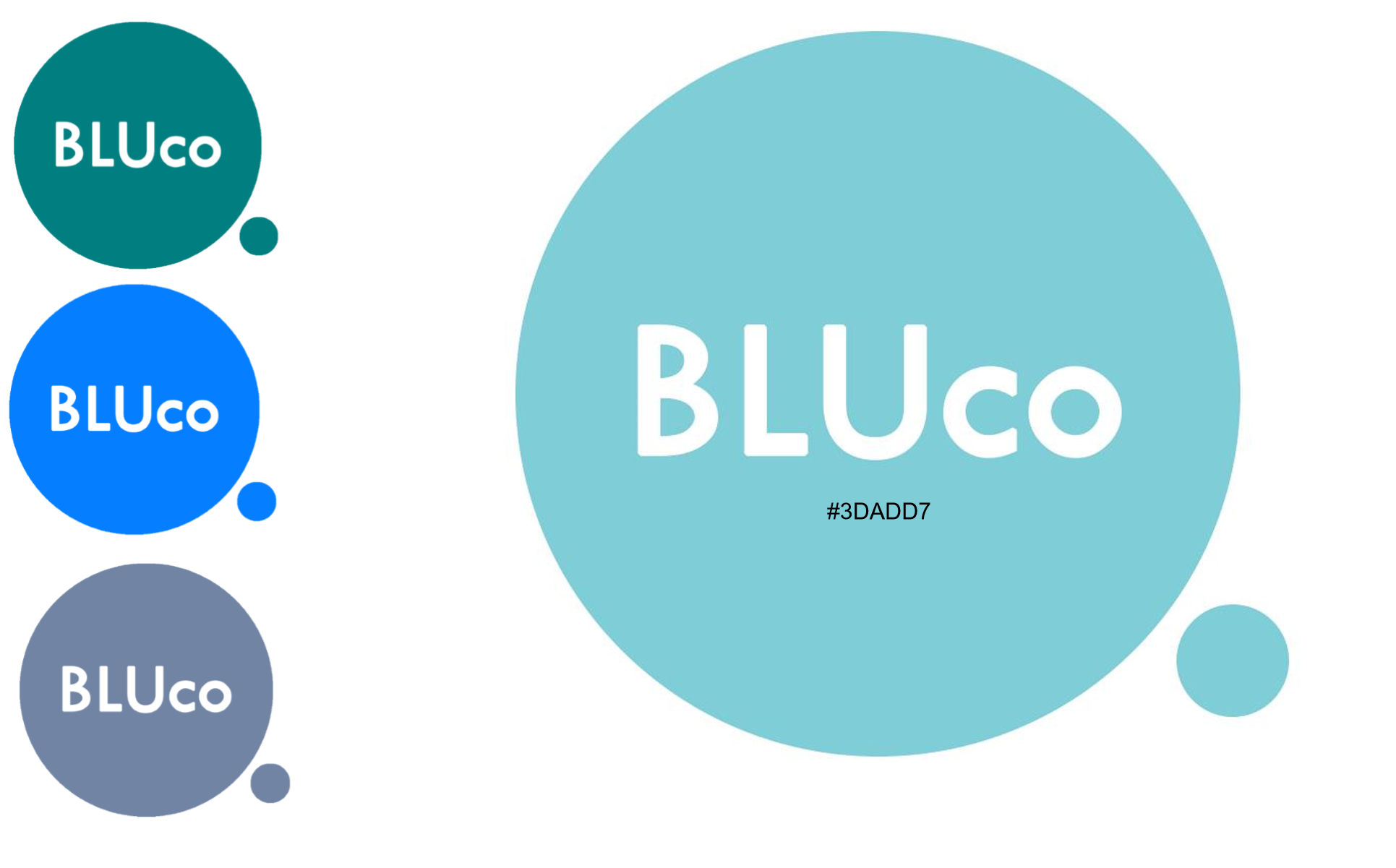
I have combine both the constructive criticism with the bold font and the combination of capitalisation and lower case letters. I believe that his is an engaging element to the viewer as it is eye catching as well as the little circle next to it. I personally believe it gives a unique touch to the design. Also i was experiementing with colours just in case is it went with my colour palate for the interactive app however everyone still liked the bright and vibrant blue colour.